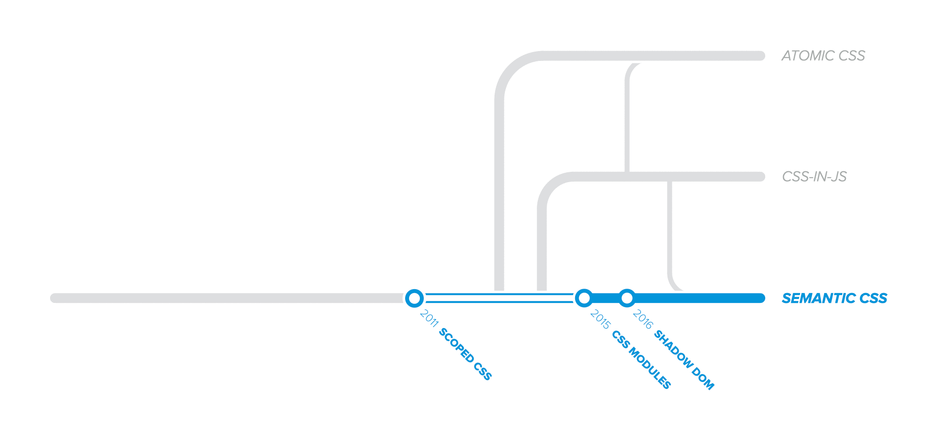
The evolution of scalable CSS is a multi-part chronicle intended to document the progress of tools, practices and techniques that enable us to write maintainable CSS at scale.
- Introduction
- Part 1: CSS scalability issues
- Part 2: Good practices
- Part 3: CSS Processors
- Part 4: Methodologies and Semantics
- Part 5: Styles Encapsulation
- Part 6: Atomic CSS
- Part 7: CSS-in-JS
- Part 8: Type-safe CSS
- Epilogue
In Part 4: Methodologies and Semantics, we've covered popular CSS methodologies and architectures such as OOCSS, BEM, SMACSS, and ITCSS. They all adopted the Semantic CSS approach, solving many maintainability issues, but only to some extent.
In this article, we'll continue the Semantic CSS pathway by turning our attention to styles encapsulation, which elegantly solves any naming collisions while keeping a low specificity at the same time. These techniques profoundly changed the way we author CSS nowadays, becoming an industry standard.
We'll cover 3 different styles encapsulation techniques:
- Scoped CSS, which was abandoned before it got popular;
- CSS Modules, which solved styles encapsulation through tooling;
- Shadow DOM, which is the standard approach built within the web platform.
Scoped CSS
For many years, developers battled against CSS scalability and maintainability issues alone, figuring out good practices and methodologies or building tools as weapons. But the problems were so critical that even WHATWG (Web Hypertext Application Technology Working Group) joined the battle at some point.
Therefore, in 2011, the standards' committee proposed the addition of a scoped attribute for CSS stylesheets, which:
[...] indicates that the styles are intended just for the subtree rooted at the style element’s parent element, as opposed to the whole Document.
Before looking at how Scoped CSS is supposed to work, let's look at a trivial example using regular CSS.
Regular CSSConsider having 2 styles definitions: an outer one and an inner one. Both definitions use the same CSS selector p {}, but they apply different text colors: the outer one blue 🔵, and the inner one red 🔴 :
<!-- Outer styles (global scope) -->
<style> p { color: blue; } </style>

<!-- Outer styles are unexpectedly overridden -->
<p> 🔴 Outer content </p>

<header>
  <!-- Inner styles (also global scope) -->
  <style> p { color: red; } </style>

  <!-- Inner styles override the outer styles -->
  <p> 🔴 Inner content </p>
</header>
With regular CSS, no matter where we place the styles definitions, they all end up in the global scope, affecting the entire document, being one of the fundamental problems of CSS.
Scoped CSSWith the new proposal, there's a scoped attribute we can specify on <style> tags.
- <style>
+ <style scoped>
So, let's see what happens when we set the scoped attribute on the inner <style> tag from the previous example:
<!-- Outer styles (global scope) -->
<style> p { color: blue; } </style>
<!-- Outer styles apply as expected -->
<p> 🔵 Outer content </p>

<header>
  <!-- Inner styles (local scope) -->
  <style scoped> p { color: red; } </style>

  <!-- Inner styles are scoped to parent element -->
  <p> 🔴 Inner content </p>
</header>
In this example, the scoped attribute prevents styles from leaking outside their parent container, which is the <header> element in our case. Whatever styles we define locally for a specific component, will not affect outer components.
Therefore, Scoped CSS addressed the global namespace problem, allowing us to define styles that don't affect elements outside the container of our choice, enabling styles encapsulation. As a result, we would not need to worry about naming collisions or unexpected style overrides.
DeprecationUnfortunately, the spec was only implemented in Firefox (but removed in version 55) and experimental in Chrome. No other browser vendors showed any interest in implementing the scoped stylesheets.
Consequently, in 2016 the scoped attribute was removed from the spec in favor of Shadow DOM, which has its own scoping mechanism.
CSS Modules
CSS features standardization is a lengthy process, as it usually takes years for a feature to reach the Candidate Recommendation (CR) stage. As a consequence, the developers' community couldn't just sit and wait for a standard solution to become available.
Therefore, in 2015, a few smart people released CSS Modules, implementing styles encapsulation through tooling instead of relying on standards.
What is a CSS Module?Typically, a CSS Module is just a regular .css file, often having the .module.css suffix to differentiate them from plain CSS files.
.heading {
  color: blue;
}
Any .css file can be used as a CSS Module. However, the opposite does not apply, as CSS Modules have a few essential particularities:
- CSS modules support additional non-standard syntax, like
:globaland:localswitches, for controlling the selector scope. - CSS modules discourage ID and type selectors, recommending using class selectors only.
- CSS modules are imported in JavaScript files instead of being directly referenced from HTML documents using
<link>tags. - CSS modules require a build step to generate the final
.cssfile containing the encapsulated styles. - CSS modules promote using one CSS file per component instead of defining all styles in a single CSS file.
As CSS Modules are not natively supported in browsers, we need a special loader to handle these files. The loader will compile .css module files into an interchangeable format called Interoperable CSS (ICSS), exporting an object containing all class definitions from the .css module file.
// we import an object from the CSS module file
import styles from "./style.module.css";

const element = document.querySelector("h1");

// defined CSS classes available as fields on the imported object
element.outerHTML = `<h1 class="${styles.heading}">Title</h1>`;
Now, the beautiful part about CSS Modules is the output, as the loader will generate unique class names for each class definition.
The exact form of the generated class name can be customized through the loader, but it typically has the [filename]__[classname]__[hash] structure:
<!-- ✅ generated class names are hashed -->
<h1 class="page__heading__2fcab5">Title</h1>
It's worth mentioning that we can control the generated output form based on the application environment. For instance:
- During development, we can use the verbose
[file]__[class]__[hash]form to enable easier debugging, as the output pinpoints the component name and the CSS class name. - For production builds, we can choose shorter names such as
[hash]for smaller document size or[class]__[hash]in case we need better debuggability in production.
Main benefits
So, what does this mean for us, the developers?
- We don't have to worry about naming collisions and unexpected overrides because the tooling takes care of this.
- We can use class names relevant to a particular component only. For example, different
.titleclasses, defined in 2 separate components, will not collide with each other.
With CSS Modules, we get all the functionality of BEM methodology, but without the hassle of manually maintaining the class names.
Explicit style dependencies
CSS Modules recommend having a separate .css file for each component. If we think about it, this makes perfect sense when considering component-based architectures, as all the concerns are grouped together: HTML markup, JavaScript behavior, and CSS styling.
On the other hand, with CSS Modules we have to explicitly import the stylesheet used by a particular component. Therefore, styles are not implicit dependencies anymore, which brings maintenance benefits that were not possible before:
- Anyone can easily figure out the source of the styles, since the
.cssfiles are explicitly imported. - Unused styles don't get bundled anymore when deleting the component, enabling dead code elimination.
Shadow DOM
As we've seen, standardization is generally a lengthy process, and Shadow DOM experienced quite a bumpy ride as well. The specification was initially launched in 2014 as an experimental technology, called Shadow DOM v0. However, similar to Scoped CSS, it didn't get enough adoption, and it was deprecated in 2018.
Fortunately, a new standard version was launched in 2016, called Shadow DOM v1. It consists of the current standard APIs known and used today.
What is Shadow DOM?Without going into any details or technicalities, Shadow DOM is a set of standard APIs implemented as part of the Document Object Model (DOM). Its purpose is to fix the CSS maintainability and scalability problems that we've discussed so far, but natively, within the web platform.
Shadow DOM fixes CSS and DOM. It introduces scoped styles to the web platform. Without tools or naming conventions [...]
Eric Bidelman, Google Developers
To create a Shadow Tree within our DOM, the only thing we need to call is the .attachShadow() method on an existing DOM element, which will become the host of the Shadow DOM:
<script>
// create an <div> element, aka the "host"
const div = document.createElement("div");
// attach a Shadow DOM subtree
const shadowRoot = div.attachShadow({ mode: "open" });
// append the <div> to document body
document.body.appendChild(div);
// set Shadow DOM content
shadowRoot.innerHTML = `
`;
</script>
Next, let's add some styles outside the Shadow DOM. We'll target all p elements by setting their color to blue 🔵:
<!-- Outer styles (global scope) -->
<style> p { color: blue; } </style>
<p> 🔵 Outer content </p>
<script>
/* ... create & attach Shadow DOM */
// Shadow DOM is not affected by outer styles
shadowRoot.innerHTML = `
`;
</script>
In contrast to Scoped CSS or CSS Modules, styles defined outside the Shadow DOM, which target contained elements, do not leak inside the Shadow DOM.
Global styles are inheritedIt's essential to understand that global styles are still inherited by Shadow DOM. For example, global styles like body { color: green; } will pierce through the Shadow DOM barrier.
<!-- Global styles -->
<style> body { color: green; } </style>
<script>
/* ... create & attach Shadow DOM */
// Global styles are inherited
shadowRoot.innerHTML = `
`;
</script>
Likewise, targetting the host element, which is the <div> in our example, will also affect the content inside the Shadow DOM.
Now, let's add some local styles inside the Shadow DOM, by changing all p elements' color to red 🔴:
<!-- Outer styles (global scope) -->
<style> p { color: blue; } </style>
<!-- Outer elements are not affected by Shadow DOM styles -->
<p> 🔵 Outer content </p>
<script>
/* ... create & attach Shadow DOM */
// Shadow DOM is affected by local styles
shadowRoot.innerHTML = `
`;
</script>

Even though we target all the p elements, any styles defined inside the Shadow DOM will not leak outside. Therefore, Shadow DOM isolates its content from the outside world, encapsulating its local styles.
In contrast with CSS Modules or Scoped CSS, we get a higher degree of encapsulation using Shadow DOM. Elements inside the Shadow DOM will not be affected by outer styles that target those elements.
However, global inheritable styles, like color, font or line-height will leak inside the Shadow DOM. This behavior is convenient in application development, enabling global styles inheritance for the entire content.
JavaScript Frameworks
Styles encapsulation became an industry-standard pretty fast. It made sense. It was simple. It had no outstanding compromises. Consequently, most JavaScript frameworks nowadays implement or recommend some form of style encapsulation.
Next.js supports CSS Modules out of the box for any CSS file that follows the
[name].module.cssnaming convention.React doesn't provide a built-in mechanism for styles encapsulation, but Create React App has built-in support for CSS Modules.
Vue.js uses the abandoned
scopedattribute to generate encapsulated CSS output while supporting CSS Modules as an alternative.Angular has two methods to handle view encapsulation. The default setting is
Emulated, which works similarly to Vue under the hood. An alternative option isShadowDom, which uses an actual shadow DOM for style scoping.Svelte also implements its own style scoping mechanism by default.
Gatsby supports CSS Modules out of the box for any CSS file containing the
.module.csssuffix.
To conclude, styles encapsulation forever changed the way we author CSS. Finally, we can say goodbye to all specificity-related problems, naming collisions, and the daunting task of figuring out unique names for Semantic CSS classes.
Styles encapsulation represents the end of global CSS.
Now that we've covered all essential Semantic CSS milestones, we need to backtrack a bit as the evolution paths diverge from now on.
In the next chapter, Part 6: Atomic CSS, we'll explore a different CSS paradigm introduced before styles encapsulation was possible. Atomic CSS solves all the problems of Semantic CSS by contradicting the fundamental principle that "class names should be semantic", using only utility classes that fully convey their implementation instead.
References
- CSS Modules: Welcome to the Future by Glen Maddern
- The End of Global CSS by Mark Dalgleish
- Web Components and the future of Modular CSS by Philip Walton