The evolution of scalable CSS is a multi-part chronicle intended to document the progress of tools, practices and techniques that enable us to write maintainable CSS at scale.
- Introduction
- Part 1: CSS scalability issues
- Part 2: Good practices
- Part 3: CSS Processors
- Part 4: Methodologies and Semantics
- Part 5: Styles Encapsulation
- Part 6: Atomic CSS
- Part 7: CSS-in-JS
- Part 8: Type-safe CSS
- Epilogue
During the Introduction we've set the stage for this chronicle, covering what scalability concerns are in a broad sense. Now, it's time to turn our attention to CSS-related ones.
However, before discussing any solutions, we must understand what these issues actually are. Below is a summary of the topics covered in this first chapter:
- The origins of CSS scalability problems;
- Selector duplication when defining media queries, pseudo classes or elements;
- Naming collisions within the global namespace;
- Specificity wars when using CSS specificity to override styles;
- Source order precedence rendering unexpected results;
- Implicit dependencies hinder debugging and code understanding;
- Zombie code increases CSS file size while being tricky to remove;
- Sharing variables between CSS and JavaScript code isn't trivial;
- Lack of type-safety due to the dynamic nature of CSS.
Origins
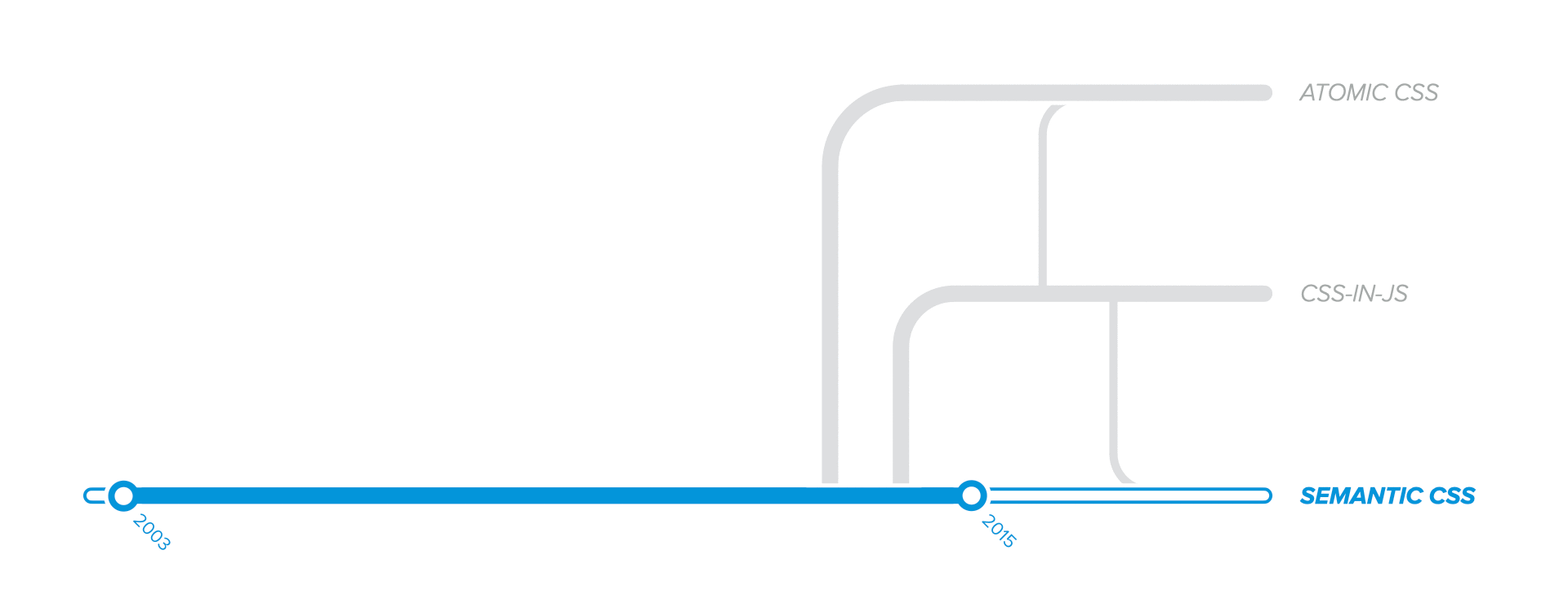
Our journey to explore the origins of CSS scalability issues takes us way back to 2003.
"Why not before?", you might ask. Well, before 2003, CSS wasn't heavily used in web development. Structure and style were not separate concerns. The HTML code we wrote also included most of the styling, which is often referred to as tag soup.
<table>
  <tr>
    <th>Posts</th>
    <th>Comments</th>
  </tr>
  <tr>
    <td align="center"><b>123</b></td>
    <td align="center"><i>4.56k</i></td>
  </tr>
</table>
All the styling for the above code is implemented purely in HTML:
- For layout, we used
<table>elements, aka. "table-based layout"; - For alignment, we used HTML attributes like
alignorvalign; - For text formatting, we used non-semantic HTML tags, such as
bori.
CSS-based layouts were possible, but not popular in 2003. As a result, only a few early adopters switched to CSS, embracing web standards, content semantics, and the separation of structure from styling.
Entirely relying on CSS for styling was a daunting task. Developers were reluctant to change, mainly because they weren't willing to rewrite existing code. In addition, they had to learn new skills, but the resources were scarce. Simon Willinson documented this on his blog:
"[...] it’s obvious that we as a community still have a long way to go in creating useful resources for people who want to make the switch to CSS."
2003, Simon Willinson, simonwillison.net
It was a slow process and a highly debated topic. Developers didn't want to give up their own skills to learn new ones. Not to mention that browsers didn't fully support CSS level 2 at that time, even though it was officially released in 1998. Therefore, switching to CSS required countless hacks.
Luckily, browser support for CSS features improved over time. More and more developers started to turn their attention to CSS. Fast-forward to 2005, CSS Zen Garden was launched, proving that CSS-based styling works. We could apply different CSS stylesheets to the same structure and content, yielding completely different results. It was a game-changer.
But, during the same year, Simon Willinson also acknowledged that maintaining CSS stylesheets is not a trivial task:
"[...] it’s safe to say that the CSS advocacy battle is slowly being won. It’s time to talk about the elephant in the corner of the room: stylesheet maintainability."
2005, Simon Willinson, simonwillison.net
So, we can safely conclude that CSS has an inherent predisposition to problems. As soon as developers started using CSS intensively, they've also encountered scalability and maintainability problems.
Therefore, let's explore the most concerning issues we usually face.
Selector duplication
One of the first CSS quirks we'll encounter when using plain CSS is code duplication. Whenever we define pseudo-classes, pseudo-elements, or media queries, we have to duplicate the CSS selector:
/* class definition */
.product_title { }

/* pseudo-class and pseudo-element */
.product_title:hover { }
.product_title::after { }

/* media query */
@media (min-width: 768px) {
  .product_title { }
  .product_title::after { }
}
Duplicating selectors during development is not a real scalability problem, more of an annoying issue. However, dealing with numerous duplicated classes could become tricky during refactorings such as renaming, moving, or deleting.
Refactoring is an essential practice during code maintenance. Therefore any aspect that impedes maintenance could potentially become a scalability concern.
Organizing media queries
We'll face an even bigger problem when dealing with responsive web pages and media queries. There are 2 methods to group the responsive styles: by media query or by CSS selector.
/* line 23 */
.product { }
.product_title { }

...

/* line 163 */
@media (min-width: 768px) {
  .product { }
  .product_title { }
}

...

/* line 390 */
@media (min-width: 1280px) {
  .product { }
  .product_title { }
}
/* line 23 */
.product { }
@media (min-width: 768px) {
  .product { }
}
@media (min-width: 1280px) {
  .product { }
}

...

/* line 390 */
.product_title { }
@media (min-width: 768px) {
  .product_title { }
}
@media (min-width: 1280px) {
  .product_title { }
}
Group by media query
As developers, we usually try to avoid code duplication as much as possible. That's why we might be tempted to define the media queries only once and include all related styles within that query.
The downside is that it's challenging to read, understand, and maintain such code. The styles related to a single element would get split into different parts of the file. Figuring out which styles apply to a particular selector becomes a scalability problem.
Group by CSS selectorTo make code easier to understand, which is crucial when we think about scaling, we could group the styles by CSS selectors. Using this approach, we don't have to search the whole file to discover which styles apply to a particular selector.
The downside of this approach is that there's a lot of duplication in the code, which is troublesome both during development and maintenance, not to mention the increased CSS output.
SolutionsIn Part 3: CSS Processors, we'll explore contextual styles, provided by various tools, which solve the problem of source code duplication.
Naming collisions
All the CSS rules that we define or import as 3rd party CSS will end up in a single global namespace. Therefore the likelihood of having 2 classes with the same name scales proportionally with the size of the code.
Reusable class names usually contain common nouns, like .modal, .button, .overlay, and so on. If we include any external file that defines the same classes, they could get overwritten, depending on which stylesheet we include last.
CSS lacks support for namespaces, so the language itself doesn't help us prevent style overwriting. A standard solution to this problem is to add a project-specific prefix, for instance, .abc-overlay. Third-party libraries usually implement this approach.
However, prefixes do not guarantee unique names. For example, when dealing with many large files, how could we be sure that nobody else added the class .abc-heading-large? Of course, we could search the entire code base to see if we have a class with the same name already defined, but this only works for static classes.
It's not unusual to deal with dynamic class names computed by custom logic. As a consequence, this would prevent us from searching for a string like .abc-heading-large:
const classname = `abc-heading-${isPromo ? "large" : "small"}`;
Not to mention that we could include stylesheets written by a different team. In this case, making sure that we don't have any naming collisions can become quite a challenge.
SolutionsThere are many solutions to this problem, some better than others:
- Part 4: Methodologies and Semantics covers methods to avoid collisions manually.
- Part 5: Styles Encapsulation covers tools that solve the naming collisions automatically.
- Part 6: Atomic CSS covers out-of-the-box solutions using utility classes.
Specificity wars
One way to avoid naming collisions is to increase the "strength of a selector", which is called specificity. It works great in the short term, but usually gets out of control sooner or later:
/* (0,1,0) we start with a simple generic "title" class */
.title {
}

/* (0,2,0) we use the same class name, for a specific "product" component */
.product .title {
}

/* (0,3,0)  but we also have a modified "discounted" variation */
.product .title.discount {
}

/* (1,3,0) also, there's a different variation inside the "promo" section */
#promo .product .title.discount {
}

/* (1,4,0) not to mention the "dark theme" styles */
.dark-theme #promo .product .title.discount {
}

/* (0,2,0) to avoid specificity problems, we'll end up using "!important" */
.special.title {
  color: blue !important; /*!important overrides specificity */
}
(1,3,2). You can also checkout an interative demo on specificity.Relying on specificity to overwrite styles usually creates a snowball effect, forcing everyone on the team to increase specificity further, thus making it harder and harder to overwrite styles.
Eventually, the only way to define new styles will be using !important. Once we reach that scenario, it will be a nightmare to extend the code.
Similar to naming collisions, there are many solutions to this problem:
- Part 2: Good practices instruct us to keep specificity "low".
- Part 4: Methodologies and Semantics covers concrete rules for implementing low specificity across the project.
- Part 6: Atomic CSS presents out-of-the-box solutions using utility classes.
Source order precedence
When we keep the specificity low, there's a higher chance of having multiple classes with the same specificity, which creates a new problem. When specificity is the same, source code order is considered, and styles that are declared later will win.
To illustrate, let's consider the following trivial example:
<!-- This should be blue 🔵, right? -->
<p class="red blue">Red or Blue?</p>
Looking at the .html file, we might think that the text will have the blue class applied, because it should override the previously applied red class. But it's not the order of CSS classes that we apply to the HTML element that matters. Instead, it's the order of the styles defined in the CSS stylesheets.
.blue { color: blue; }
.red { color: red; }
/* since 🔴 red is declared last, it wins the cascade */
When looking at the .css file, we see that .red is defined later, which means that its styles win the CSS Cascade priority because both selectors have the same specificity. Keep in mind that the .red class could be defined in a separate stylesheet included later in the document.
Now, let's look at different scenarios that could seriously affect us:
- Consider that we're adding a new class to an element, but the styles don't get applied because other CSS classes defined (or included) later in code take precedence.
- Consider breaking the styles of a page only because we refactored our stylesheet by changing the order of some style definitions.
- Working with dynamically loaded stylesheets could render non-deterministic styles resolution, becoming a nightmare to manage.
Various approaches tried to solve the source order problem:
- Part 4: Methodologies and Semantics describes how to deal with it manually.
- Part 6: Atomic CSS and Part 7: CSS-in-JS offer out-of-the-box solutions.
Implicit dependencies
CSS stylesheets work by default as explicit dependencies for HTML because we have to explicitly reference them in the <head> part of the document.
<html lang="en">
  <head>
    <!-- "style.css" is an Explicit Dependency for page.html -->
    <link rel="stylesheet" href="style.css" />
  </head>
</html>
On the other hand, CSS rules and selectors work as implicit dependencies for HTML code, because we don't explicitly import them. Instead, we just assume they exist.
// the ".modal" class is an Implicit Dependency for component.js
document.appendChild(`
  <div class="modal">...</div>
`);
Implicit dependencies in general, not limited to CSS, are inherently problematic because:
- Code navigation is cumbersome as it's not trivial to figure out where dependencies come from, nor how to get to their definition and implementation.
- Their runtime availability is non-deterministic. We'll never know if the dependencies will be available when needed. They could be lazy-loaded, for instance.
- Browsers will fail silently without any warning if the styles referenced by our markup are not available. This is specific to CSS, being both a blessing and a curse.
CSS Modules covered in Part 5: Styles Encapsulation and CSS-in-JS discussed in Part 7: CSS-in-JS significantly improve the development experience by making use of explicit dependencies.
Zombie code
CSS code, like any other code, will increase in size indefinitely. The particular problem with CSS is that large .css files will often contain code that's not referenced anywhere in HTML.
🧟 Unused code is also called zombie code because it should be dead, but somehow manages to linger around. It's not used anywhere, but it exists in an undead form.
The zombie code phenomenon usually happens when:
- We remove HTML markup but forget to delete the associated styles.
- We want to delete the associated styles, but we have no idea if they are used elsewhere within the codebase. So, instead of risking breaking existing code, we choose not to remove existing styles. Extra styles won't hurt anybody, right?
<p class="promo">
  <h2>Promo title</h2>

  <!-- 🧹 This will get removed at some point... -->
  <p>Promo text ...</p>

  <a href="/promo">Check this out</a>
</p>
.promo {
  font-size: 1.5em;
}

/* 🧟 Styles will be left in the codebase */
.promo p {
  color: purple;
}
We avoid deleting CSS code because making sure that the code really is unused is not trivial. As time goes by, we'll undoubtedly ship more CSS code than is actually needed, slowing down the page load and making the codebase less and less manageable. No tool could safely tell us which CSS selectors are unused, because CSS cannot be statically analyzed.
There are tools to detect unused CSS in static websites and even some attempts to remove unused CSS. However, they work only to some extend.
SolutionsPart 5: Styles Encapsulation and Part 7: CSS-in-JS specifically address the issue of zombie code, successfully avoiding unused CSS code.
Shared variables
Dynamic styling with JavaScript is usually implemented by adding or removing CSS classes on HTML elements. This approach creates a clear separation between styling and logic.
However, there are particular scenarios when we might want to share some values between CSS and JavaScript. For instance:
- Using breakpoint values in CSS media queries and matchMedia API for Responsive Web Design (RWD) or Adaptive Web Design.
- Using color variables in CSS and passing them to 3rd party libraries that require initialization from JavaScript.
- Using elements size or position as CSS values for
width,height,topand reusing them in JavaScript computations for dynamic styling. - Using the same animation durations in CSS Transitions and with JavaScript animation libraries as well.
- Last but not least, design tokens are fundamental building blocks of any design system, so sharing such values becomes a necessity if we're using such a system for our UI code.
Thus, let's explore a few approaches to share values between CSS and JavaScript.
Using (S)CSS as the source of truthOne approach is to define the variables in our (S)CSS files, either as CSS custom properties, SASS variables, or CSS Modules @values, and expose them to be importable in JavaScript.
Without going into the technicalities, there are solutions to share variables from CSS to JavaScript, using any aforementioned method to define CSS variables.
Using JS as the source of truthThe alternative is to store the values in JavaScript variables or objects and expose them to (S)CSS. This approach looks more convenient if we think about Universal Design Tokens (UDT), which suggests using JSON as an interchangeable data format. And we all know that JSON plays nicely with JavaScript.
Again, there are technical solutions for exporting JS/JSON structures to SASS variables, CSS Modules, or CSS custom properties.
LimitationsAs you probably saw in the examples or conclude from your personal experience, none of the implementations is trivial. They look more like workarounds instead of solid and elegant solutions. In addition:
- Even though there is a single source of truth, we still have to maintain two sets of definitions: in (S)CSS and JS. Changing any variable name or value in one language requires a manual update of the other as well.
- Automatic refactorings are not available for CSS values, so they require manual effort, which, as we know, is never fun to perform. As a consequence, their initial name will likely never change. On the long run, we could end up with definitions like
$dark_red: orange;. - Code editors cannot display suggestions for defined (S)CSS variables, making them difficult to discover, especially to developers unfamiliar with the code. Some plugins attempt to support this limitation, but only to some extent.
In Part 7: CSS-in-JS, we'll see how easy and elegant it is to share variables with CSS-in-JS approaches. Defining styles in JavaScript files enables access to any JS value.
Lack of type-safety
Let's take a look at HTML parsers for a second. We used to have Strict Doctypes for HTML4 and XHTML1, which enforced strict parsing rules for .html documents. However, after long battles, HTML5 defeated XHTML2 in the popularity contest, while also dropping support for a Strict Doctype.
Therefore, we are allowed to write any gibberish code, because the parsers will make their best effort to fix any syntax errors and render any invalid code:
<!-- incorrect tag nesting -->
<div><em>...</div></em>

<!-- unclosed tags -->
<ul> <li>item 1 <li>item 2
HTML5 accepts the reality of all browsers using error-correcting tag-soup parsers
David Andersson, digital-web.com
Similarly, CSS parsers are also pretty relaxed. So, we got used to its unsafe nature. We had to, as there was no better alternative.
However, the tables had turned when static type-checkers like TypeScript and Flow became popular and made their way into UI development. Unfortunately, they don't provide type-safety for CSS styles:
- Navigating CSS code is cumbersome because we cannot use code editor features such as "Go to Definition" or "Find references", to determine which styles apply to a particular element or where specific classes are applied.
- Refactoring CSS code is not safe because the tooling doesn't help to highlight syntax errors when renaming or removing CSS classes. Consequently, developers will be afraid to touch or modify any existing code, ultimately leading to code rot.
- Editors lack productivity features support such as auto-complete and type-checking variables, highlighting unused code, or discovering available CSS classes and variables. Without these features, developers are dependent on high cognitive load to either remember how CSS classes or variables are named or constantly copy & paste them.
Part 8: Type-safe CSS addresses type-safety concerns by using TypeScript on top of existing CSS-in-JS solutions and bringing the benefits of statically typed languages into the CSS world.
Now that we understand the most concerning problems with writing and maintaining CSS code at scale, let's turn our attention to the solutions that solve them.
In the following chapter, Part 2: Good practices, we'll explore the first iteration of methods to alleviate the problems of complex CSS selectors and specificity wars.
References
- The difficulties of learning CSS by 456 Berea Street
- Defending Structural Markup by Simon Willison
- CSS Inheritance, Cascade, and Specificity by Ellen Grabiner
- Specifics on CSS Specificity by Chris Coyier