The evolution of scalable CSS is a multi-part chronicle intended to document the progress of tools, practices and techniques that enable us to write maintainable CSS at scale.
- Introduction
- Part 1: CSS scalability issues
- Part 2: Good practices
- Part 3: CSS Processors
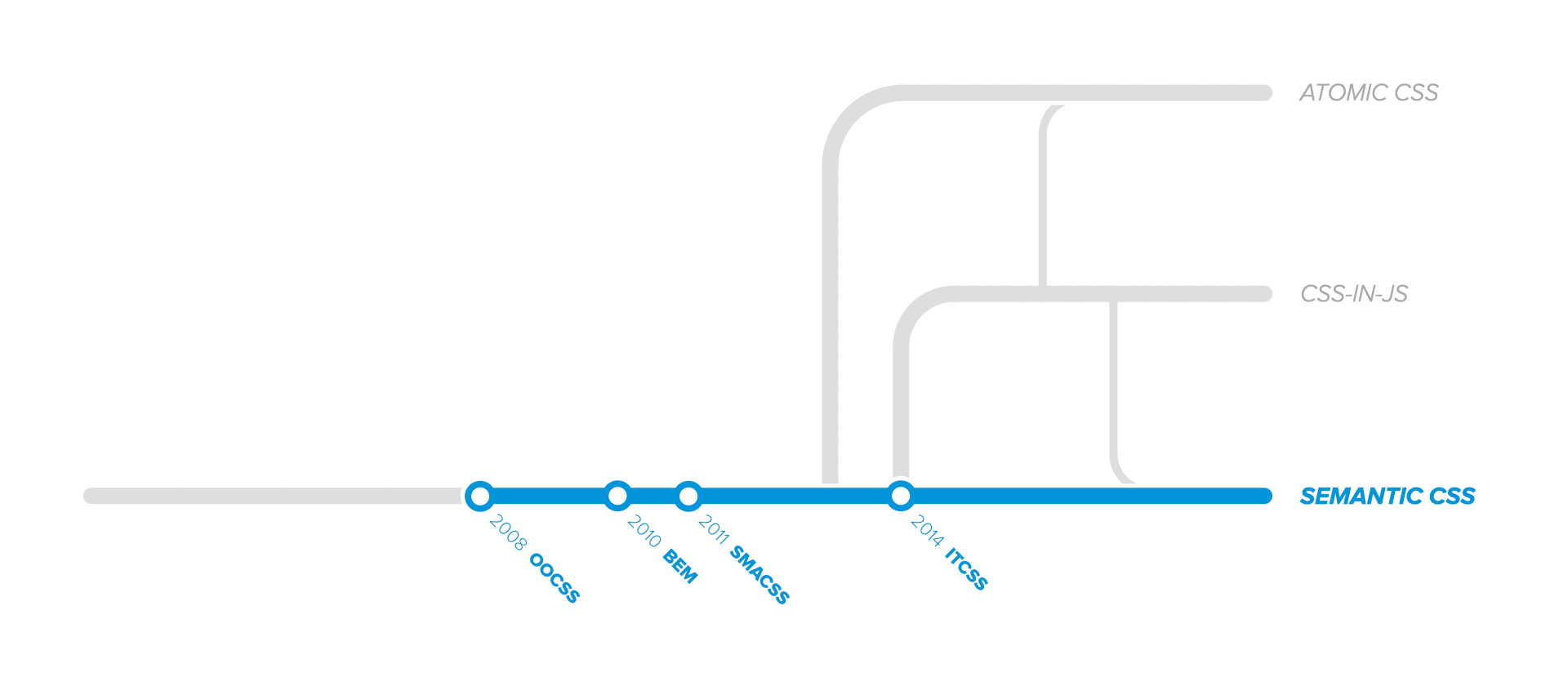
- Part 4: Methodologies and Semantics
- Part 5: Styles Encapsulation
- Part 6: Atomic CSS
- Part 7: CSS-in-JS
- Part 8: Type-safe CSS
- Epilogue
In the previous article, Part 3: CSS Processors, we've witnessed how preprocessors reduce most source code duplication while postprocessing optimizes the output code.
However, one topic that we haven't touched upon yet is how to reuse larger blocks of code or organize large CSS stylesheets.
In this article, we'll take a look at several methodologies and architectures built on top of many of the good practices that we've already covered. We'll notice that the solutions presented here are more opinionated than individual practices. However, they also provide a cohesive and structured set of rules, making them easier to adopt and implement.
Here's a summary of this chapter:
- The birth of components touches upon OOCSS, which popularized identifying and reusing abstract content blocks;
- Naming conventions covers BEM, a pioneering technique that emphasized the component-based mindset;
- High-level architecture looks briefly at SMACSS and ITCSS as solutions for structuring application-wide CSS code;
- Semantic CSS examines the status quo and the standard approach to CSS authoring.
The birth of components
In 2008, Nicole Sullivan introduced OOCSS, which stands for Object Oriented CSS. It was probably the first popular approach that taught us to identify repeating visual patterns and develop re-usable abstract objects in CSS. However, OOCSS became popular only in 2010 with the introduction of the media object.
An object should look the same, no matter where you put it.
The term component was not popularized at that time, but the resemblance is obvious between how we think about components today and how Nicole described her objects. Not to mention that she also referred to them as "web Lego".
TakeawaysThere are two essential things to take away from OOCSS that are still applicable in today's applications:
Separate container from content, or in other words, the objects (or components) should provide only the abstract container, while the consumers of the objects should provide their own specific content. This way, we gain high reusability because each consumer of the container can pass its custom content.
In today's terms, the "content" refers to
childrenin React,<ng-content>in Angular, or<slot>elements in Vue.js or Web Components.Separate structure from skin, or in other words being able to apply different skins to the same structure. This way, we gain high extensibility and customization because different styles can be applied to the same structure.
Nowadays, we usually refer to "skins" as component
variantsorthemes.
OOCSS focused more on the principles of what components are and how to identify them. Therefore, it doesn't provide details regarding the technicalities of writing the required code.
Naming conventions
BEM was developed at Yandex long before OOCSS, used internally under different names. However, it was open-sourced only in 2010.
BEM stands for Block-Element-Modifier. It taught us to think of our pages and application screens as a hierarchy of independent Blocks, which we call Components nowadays. Therefore, any Block could be used in any part of any page of the application. Likewise, any Block can contain other Blocks.
Blocks can also contain Elements, which represent content dependent on their respective Block. If an Element is independent and could be used anywhere else, not only inside a specific Block, it becomes a Block itself.
Last but not least, both Blocks and Elements are customizable by one or more Modifiers.
The BEM methodology defines CSS selector naming conventions that solve a range of web development problems.
As far as we know, BEM is the first approach that proposed using a single, unique, and semantic CSS class to identify and refer to HTML elements:
.main-menucould be the name of the block CSS class;.main-menu__item-linkcould be the name of an element of the block, which makes no sense outside of the block it belongs to;.main-menu--stickyand.main-menu__item-link--activecould be the name of modifiers for the block and the element, respectively.
Avoid descendant combinators
We don't need descendant combinators if we use unique CSS class names. Following this simple rule results in low specificity for the majority of our code.
/* ❌ descendants increase specificity (0.2.0) */
.main-menu .link {}

/* ✅ unique classes don't require descendants (0.1.0) */
.main-menu__link {}
To override styles, we don't need compound selectors if we use unique CSS class names. It seems so obvious right now, so I honestly have no idea why we were so blind back then.
.main-menu {
  position: relative;
}

/* ❌ compound selectors increase specificity (0.2.0) */
.main-menu.sticky {
  position: sticky;
}
.main-menu {
  position: relative;
}

/* ✅ single classes have constant specificity (0.1.0) */
.main-menu--sticky {
  position: sticky;
}
Using BEM modifier classes in HTML doesn't change much from the standard approach, as we still apply two classes. The only caveat is the longer class name when considering BEM methodology.
-<ul class="main-menu sticky">
+<ul class="main-menu main-menu--sticky">
   ...
 </ul>
BEM truly emphasized the component-based mindset in UI development. But probably the important legacy that BEM popularized is the naming conventions:
- using unique CSS class names;
- with low and non-increasing specificity.
These simple rules scale pretty well from a technical perspective. However, finding unique names for all CSS classes in the global namespace becomes really problematic in large applications. Therefore, it doesn't scale well from the development perspective.
High-level architecture
So far, we've only looked at individual component styling techniques. But when architecting an entire website or application, structuring all the CSS code becomes an important task, as well. We need to maintain multiple categories of CSS rules: default styles, re-usable styles, non-reusable styles, utility classes, etc.
That's where CSS architectures started to emerge.
SMACSS is the first popular approach that addressed the topic of large-scale project-wide CSS architecture. It stands for Scalable and Modular Architecture for CSS and it was coined by Jonathan Snook in 2011.
ITCSS is another popular architecture introduced in 2014 by Harry Roberts. It stands for Inverted Triangle CSS.
As mentioned, we won't dive into the specific details of each of these approaches. However, the essential thing to learn is that there are multiple layers of CSS rules that we need to consider when structuring the CSS code base for an entire application:
- We have some base rules, very generic styles using only type selectors, without classes. These rules contain CSS resets, typography, variables, etc.
- Then we have layout rules (or objects as called in ITCSS). These are typically abstract components containing minimal styling, used only for layout. Such components include Grid systems, Media object, Stack and Divider components, etc.
- The above layout components will contain concrete components (or modules as called in SMACSS). These are the actual UI parts, having application-specific styling including:
- highly re-usable and abstract components, such as Button, Modal, Form elements, Tooltip, etc;
- domain-specific components bound to the application domain, like ProductCard, Breadcrumb, Carousel, Avatar, and so on;
- Lastly, we have overrides (called trumps in ITCSS and state in SMACSS). These are single-purpose utility classes that override other styles.
Semantic CSS
At the time when these methodologies were coined, there was a strong buzz around Semantic HTML. Since CSS and HTML go hand in hand, it was a no-brainer that "CSS should also be semantic". Even the HTML5 specification preaches this approach:
[...] authors are encouraged to use values that describe the nature of the content, rather than values that describe the desired presentation of the content.
Everything that we've talked about so far can be included in the semantic approach of CSS, which says that CSS class names should convey meaning, not implementation. In other words, a semantic name should express what it represents and not how it looks.
<!-- Semantic (conveys meaning) -->
<nav class="main-menu"></nav>

<!-- Non-Semantic (conveys implementation) -->
<nav class="flex column bg-dark pad-md align-center"></nav>
Semantic CSS Frameworks
The vast majority of CSS frameworks that we know today were built on top of many of the principles described above, embracing the semantic CSS approach. Some popular semantic CSS frameworks include Foundation, Bootstrap, Semantic UI, UIKit, Bulma, and many more.
Semantic CSS limitationsIf we get trapped inside the semantic bubble, we might get the impression that this is "the right way" to author CSS code, especially since official guides tell us so.
But when we step outside the bubble and look objectively at Semantic CSS, we have to admit that it has some serious shortcomings:
- There's usually a lot of repetition in the written CSS rules. We'll surely have lots of
display: flex,font-weight: bold, orposition: relativein our code, which results in larger than needed file size in the end. - The size of our CSS files will continually grow as we develop new features, components, or pages. The reusability of styles is limited to the reusability of the components they relate to.
- Anytime a single CSS rule changes, the cached
.cssfile containing the rule gets invalidated. Frequent styles updates could make the caching mechanism built in the browsers totally inefficient. - Last but not least, naming things is inherently difficult. In addition, making sure there are no class names collisions in the global namespace, with a continually increasing codebase, is a daunting task.
Therefore, considering the last reason alone, Semantic CSS doesn't easily scale.
Whenever there's a debatable status quo, there will always be someone to question it. The same thing happened in 2013 with Semantic CSS, when a new paradigm was born as an attempt to solve the above shortcomings. We'll cover Atomic CSS in a later chapter.
For now, we'll continue the Semantic CSS journey with Part 5: Styles Encapsulation, which explores different methods to write scoped CSS. These techniques enabled us to elegantly avoid naming collisions within the global namespace, eventually becoming an industry standard.
References and further reading
- About HTML semantics and front-end architecture by Nicolas Gallagher
- CSS and Scalability by Adam Morse
- Battling BEM CSS by David Berner